Context
AARP wanted an MVP Mood Journal to add to their feature list of products for their 55+ demographic. The project included validating its desirability and effectiveness through usability testing. I worked with a product owner and project manager as the sole designer to iterate on and present final design to the c-suite team.
Mood Journal App
My Roles
+ Individual contributor
+ Usability testing and interviews
+ Information architecture
+ Wireframes and app design
+ Prototype function and flow
Problems
After the first round discovery and design of the MVP, testers found difficulty with some of the usability and were overwhelmed with too much content and information overload in certain areas of the experience.
Project Wins
Round 1 usability testing got us approved to continue on the next design round. Overall the feedback was very positive, and 100% of participants (even those not interested in journaling themselves) saw the benefit and would recommend it to a friend.
Discovery
Overall Problem Statement
As a subscription service, the AARP Staying Sharp audience needs a way to build personal awareness and self-improvement rather than mental disorder management.
I was initially supplied with a preliminary requirements doc that included a feature list and sitemap. The plan was to evolve these ideas and features while keeping the 55+ target demographic top of mind.
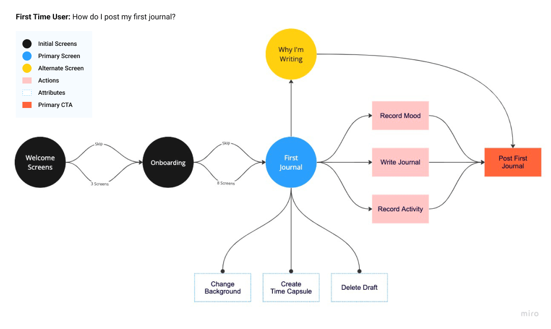
User Flow: First-Time User
Many ideas were on the table for welcoming the user including onboarding tips, starting them with a why, and various attributes and features of journaling. A User Flow was created to visualize what that could look like from the first screen to our primary action. We essentially wanted to see as little friction as possible before the user writes their first journal.
Competitor Analysis
An analysis was done to understand the strengths, weaknesses, and unique features of the competitors and other similar products to help gain insight and promote ideation.
Wireframes
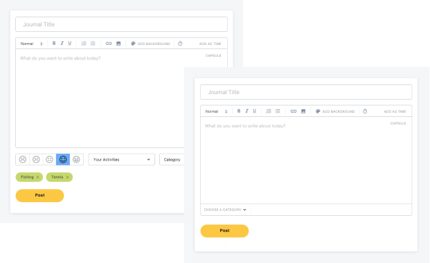
The wireframe process helped us rapidly visualize and iterate on various structures and features that we could decide to keep and continue with or remove entirely. As an example, an early iteration of the Journal included adding and saving categories. As we iterated to simplify and improve usability, the internal team found the categories to be superfluous.
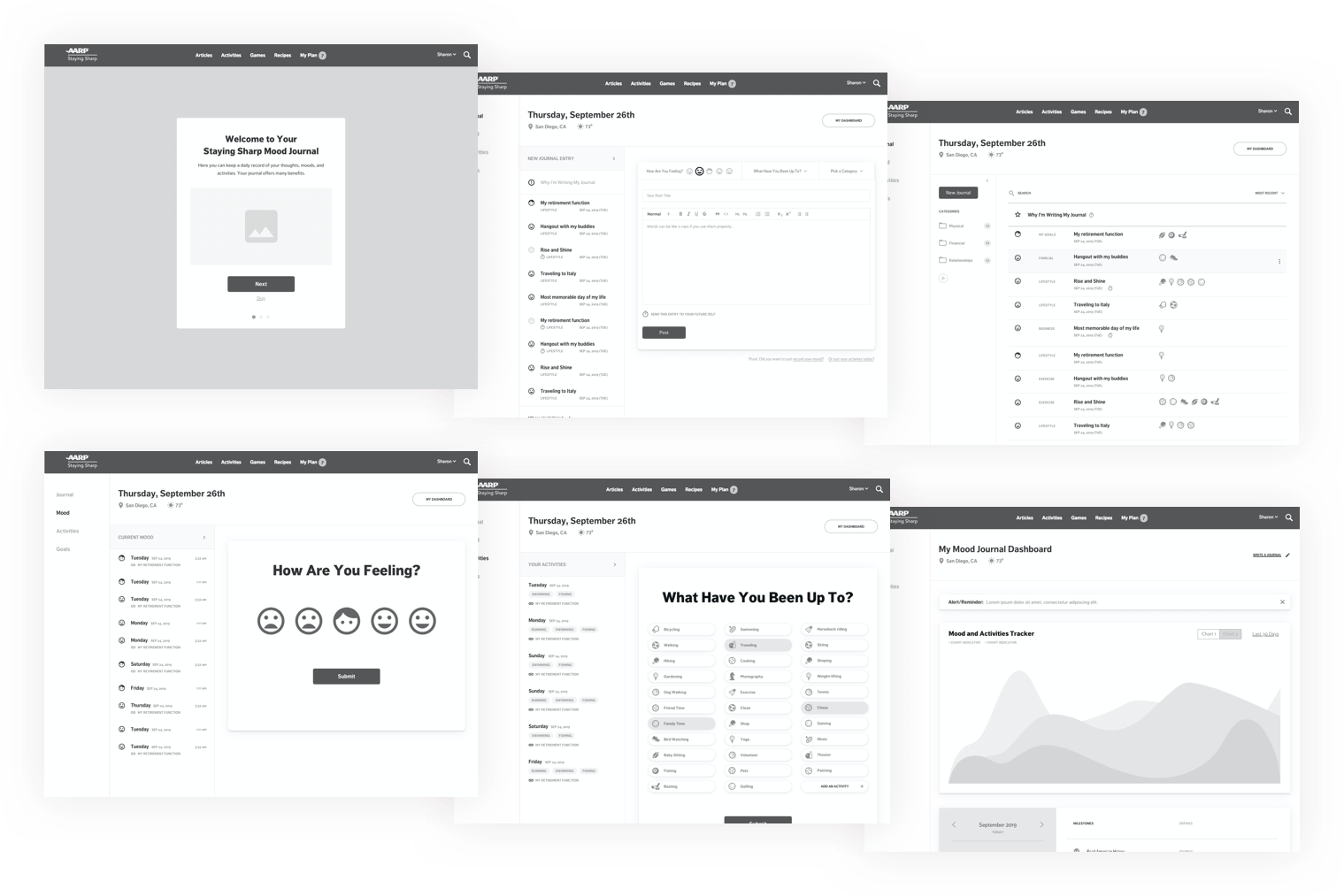
Round 1 Designs
The team continued internal dialogue with further questions and experiments to introduce into the usability testing phase. Moving into a quick round of visual designs was decided on so our test users wouldn’t be confused by plain wireframes. This did entail designing the entirety of the product and feature sets with more than 45 screens in the prototype.
Usability Testing
I teamed up with the Project Manager to script and conduct the usability test interviews. We interviewed ten participants, walking them through the prototype via live video conference. The participants were recruited through AARP’s resources and reflected the target personas. The participants also had a varied range of experience with journaling as well as technical competence that were made note of during sessions.
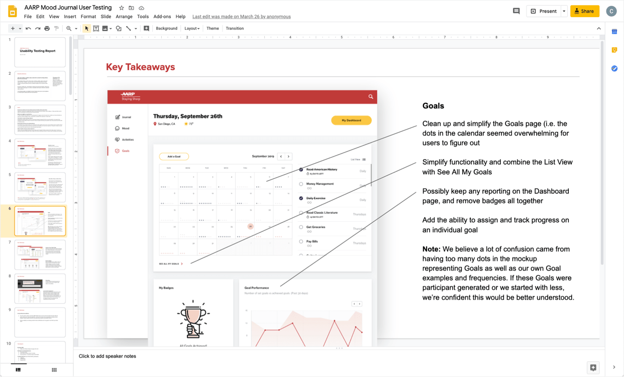
The testing culminated in a 52-page report and presentation to the C-suite team highlighting our findings and proving the validity of moving forward with the product.
Testing Goals
- Evaluate user preference for associating moods and activities with journal entries
- Gather user insights on mood-tracking (by showcasing variations on concepts)
- Test product concept with target audience (would they use and find value in the Mood Journal)
- Reveal points of friction and confusing features
- Gather insights to improve product experience
Presentation Includes
+ Executive Summary
+ Goals
+ Key Takeaways
+ Participant Profiles
+ Testing Methodology
+ Results by Page
+ Post Test Questions
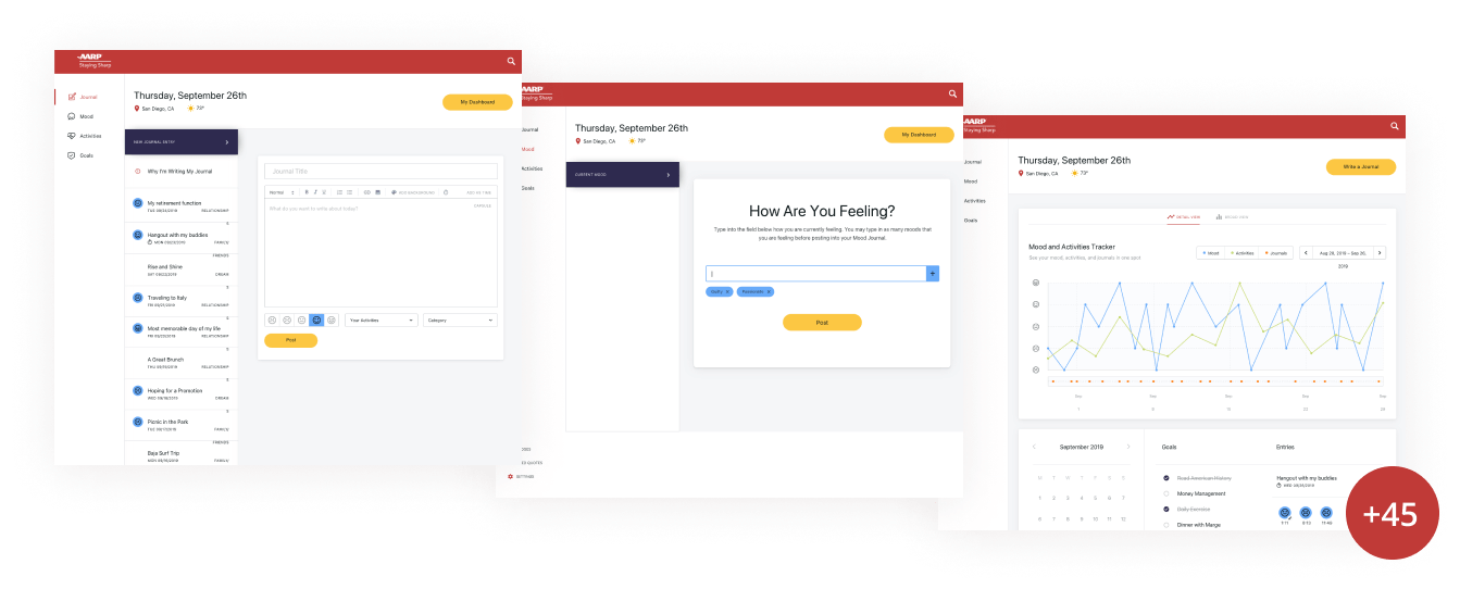
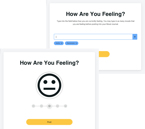
Simplifying the Journal
80% liked the idea of adding activities to their daily journal. We did observe a preference for the simple version, but participants did want the functionality. This translated to a simplified design that kept the features for round 2.
Mood Tracker
80% felt 5 options in the Mood Tracker would give them enough flexibility to accurately track their mood rather than a more complex input field.

Onboarding
After a few tests were conducted, a decision was made to alter the script to ask about an onboarding experience. With an option to skip, the onboarding guide was a preferred method to answer unknowns for first-time users.
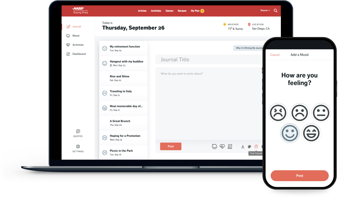
Final Design from Insights and Feedback
Overall ease of use and simplicity were paramount in making a great experience for the AARP demographic. A couple of major pieces of insight gained universally was to increase the type size along with reassuring users the AARP infrastructure is secure and user’s data will remain safe and private.
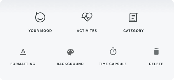
Icons to Help Simplify Interactivity
To keep the journal simple and account for all features, an icon set was developed to launch each node of functionality – complete with rollover tooltips.
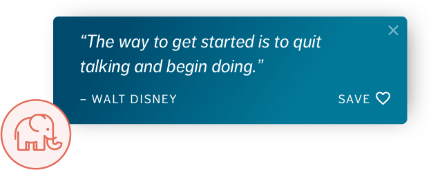
Randomized Quotes
Using “Ellie” the Mood Journal mascot, we played with quotes as an idea to delight users and measure interest/engagement. 90% of users identified Ellie with memory and enjoyed this ubiquitous mascot.
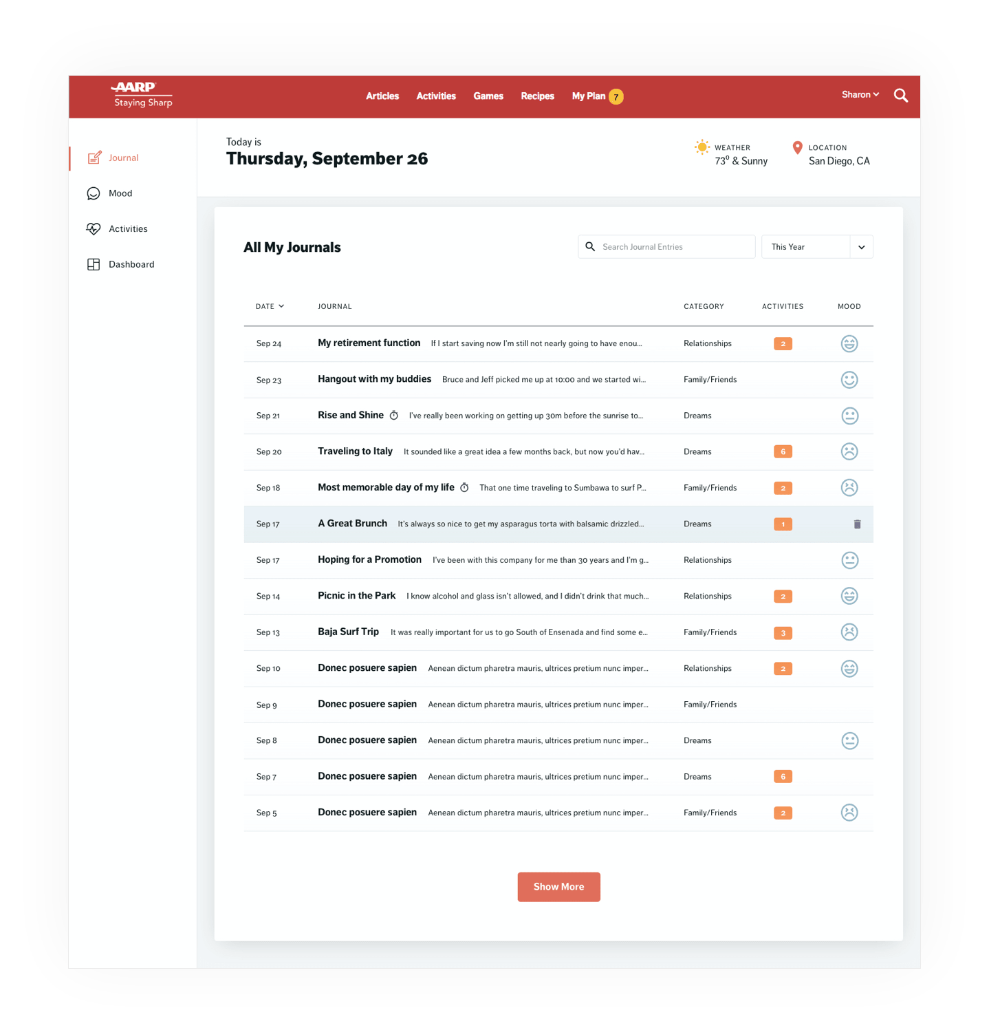
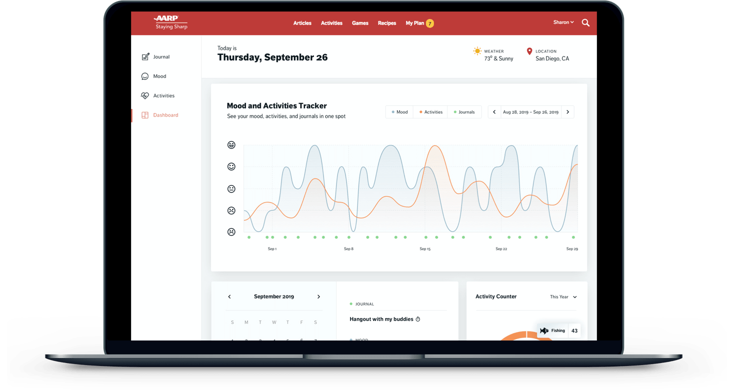
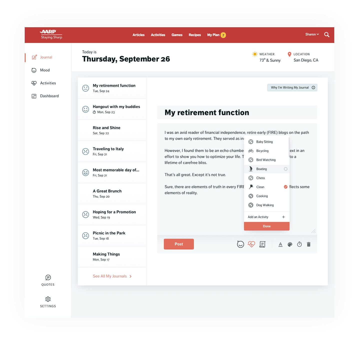
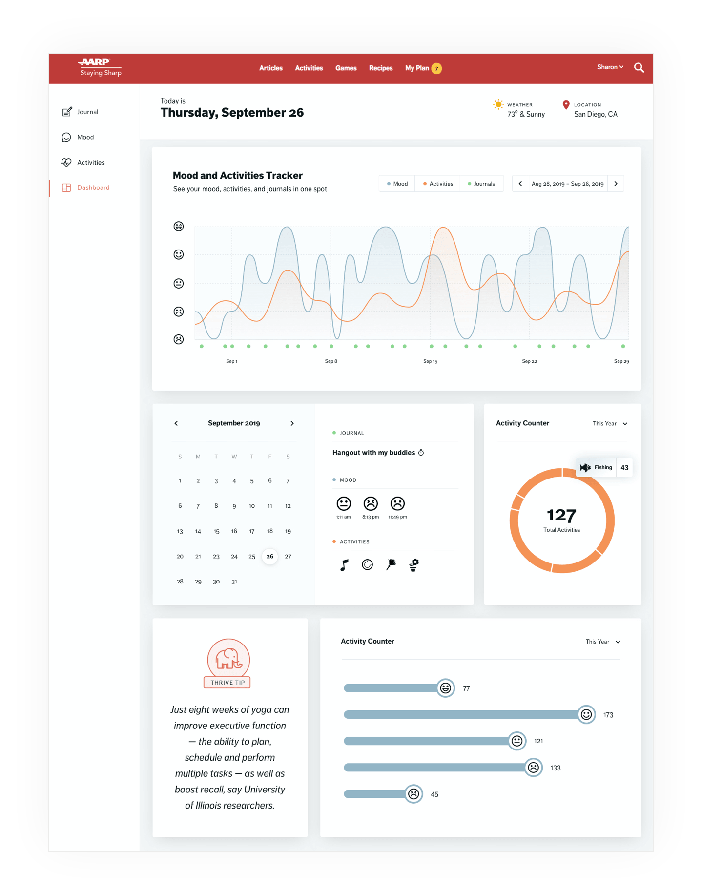
The Tracking and Analytics Dashboard
The dashboard is the area that holds all the important data for the AARP audience to keep track of their moods, activities, and journaling. Most users understood and described the features and functionality of the page correctly. Many were pleased to see how everything correlates in this view. Some insights that were implemented include…
- Keep the mood graph rather than a cloud idea
- Update titles for clarity. Some users thought the title “Journal” meant they could journal on this page
- Remove complex features such as editing a past journal
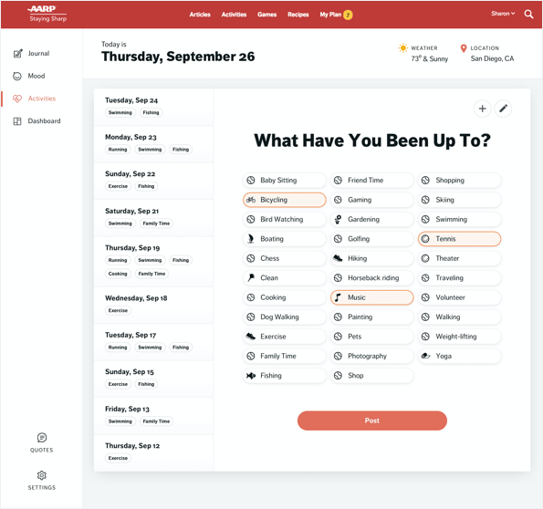
Mark Daily Activities
Removed added complexities such as correlated moods, journals, and categories and simplified the color scheme.
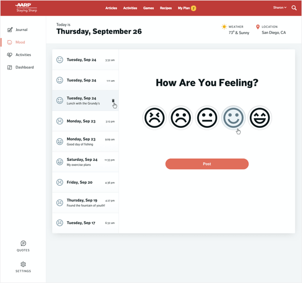
Rate Your Mood
After testing a handful of variations, participants preferred this simplified approach.
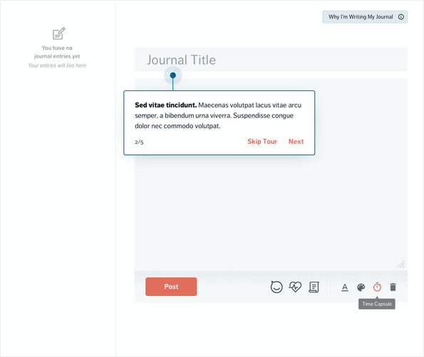
An Educational Onboarding Process
Most of the participants agreed that an optional onboarding feature would help as a first-time user.
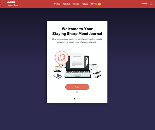
Friendly Welcome Screens
As welcome screens are a common feature for many journal products, we did learn that highlighting safety and security regarding the users’s data was of utmost importance.
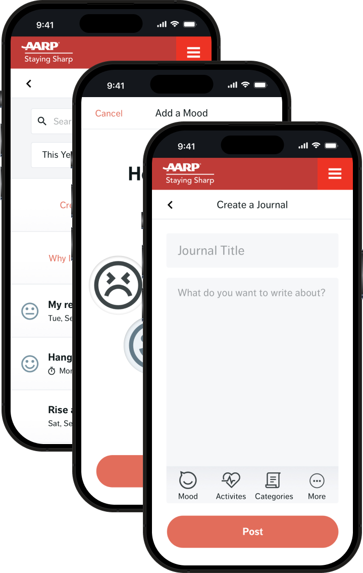
Mobile Solutions
The agreement of the project was for delivery on a desktop version only – as much of our audience would still be on this device size. I did however make the case that, as the project may evolve, some mobile thinking should be put in place as to not shoot ourselves in the foot in the case that we do move into mobile solutions. Whether or not I create a project mobile first or vice versa, my mind will always solve for various device sizes. I followed up at the completion of the desktop project to showcase the main screens and how they would translate.
Conclusion
As an individual contributor to the project, I saw success in bringing this product to life and validating its usefulness. The product was presented to the executive team and received terrific feedback – especially with the validation beyond our own subjectivity.
Learnings
Spending some time on visual design helped our testers feel good about the credibility and cleanliness of the product. However, it seems like some of that time may have been better spent on a few more iterations of the structure and flow of the overall app. Also, a lot of production time was spent on areas that already have patterns of best practices such as calendars and date pickers, icon sourcing, etc. Testers were forced to give feedback on a seemingly finished and polished product without the ability to envision other possibilities that could have opened up an overall easier approach.
Feeback Highlights